
Imagine a world where a person can simply drag a data file into a graphing utility and a plot will be made -- including axes with the data's units. Imagine that data from data other sources (with other units) can then be dragged in for comparison, with all data plotted on an interactive graph. Imagine that the units of all of these datasets will be converted automatically, as needed, during the plotting.
Create interactive plots just by drag-and-drop of JSON records. Share the json files for easy plotting by others. JSONGrapher will automatically convert units between records to plot the data sets together, to enable comparisons. For example, if one record is in kg/s and another in g/s, JSONGrapher will do the conversion automatically to plot both records together, for comparison. Tools and examples are included for how to create JSON records.
To use python JSONGrapher, first install it using conda or pip:
pip install JSONGrapher[COMPLETE] or conda install conda-forge::jsongrapher
Alternatively, you can download the directory directly.
To create an interactive plot, you just need one line of code!
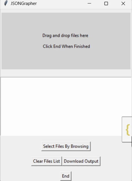
Then drag an example JSONGrapher record into the window to plot! Below are example 2D and 3D plots.
Further below shows how easy it is to create your own json records.
import JSONGrapher; JSONGrapher.launch()
# Then just drag records into the window!


The remainder of this landing page follows a json record tutorial example which shows how to create graphable .json records. The records can then be plotted with python JSONGrapher or with jsongrapher.com
Let's create an example where we plot the height of a pear tree over several years.
Record = JSONRecordCreator.create_new_JSONGrapherRecord()
x_label_including_units = "Time (years)"
y_label_including_units = "Height (m)"
time_in_years = [0, 1, 2, 3, 4]
tree_heights = [0, 0.42, 0.86, 1.19, 1.45]
Record.set_comments("Tree Growth Data collected from the US National Arboretum")
Record.set_datatype("Tree_Growth_Curve")
Record.set_x_axis_label_including_units(x_label_including_units)
Record.set_y_axis_label_including_units(y_label_including_units)
Record.add_data_series(series_name="pear tree growth", x_values=time_in_years, y_values=tree_heights, plot_type="scatter_spline")
Record.set_graph_title("Pear Tree Growth Versus Time")
We can export a record to a .json file, which can then be used with JSONGrapher.
Record.export_to_json_file("ExampleFromTutorial.json")
Record.print_to_inspect()
Expected Output:
JSONGrapher Record exported to, ./ExampleFromTutorial.json
{
    "comments": "Tree Growth Data collected from the US National Arboretum",
    "datatype": "Tree_Growth_Curve",
    "data": [
        {
            "name": "pear tree growth",
            "x": [0, 1, 2, 3, 4],
            "y": [0, 0.42, 0.86, 1.19, 1.45],
            "type": "scatter",
            "line": { "shape": "spline" }
        }
    ],
    "layout": {
        "title": "Pear Tree Growth Versus Time",
        "xaxis": { "title": "Time (year)" },
        "yaxis": { "title": "Height (m)" }
    }
}
We can plot the data with plotly, interact with the graph, and save as a png file.
Record.plot_with_plotly() #Try hovering your mouse over points after this command!

We can plot the data using Matplotlib and export the plot as a PNG file.
Record.plot_with_matplotlib()
Record.export_to_matplotlib_png("image_from_tutorial_matplotlib_fig")

You can also see more examples: https://github.com/AdityaSavara/jsongrapher-py/tree/main/tutorials
Additionally, json records you send to others can be plotted by them at www.jsongrapher.com This 'see the plot using a browser' capability is intended to facilitate including JSONGrapher records in supporting information of scientific publications.
These interactions should be through github at https://github.com/AdityaSavara/jsongrapher-py
To contribute to JSONGrapher, make a pull request with sufficient details about what issue you are trying to solve, and adequate commenting in your code to follow the logic. After that, be prepared for further communication if needed.
To suggest features, create a new issue under the issues tab.
To report issues, create a new issue under the issues tab.